The Essential Guide To Pairing Fonts With AI Generated Logos
Typography: The Essential Finishing Touch for AI-Generated Logos
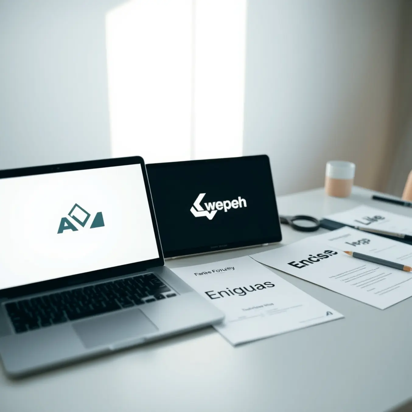
Typography serves as the essential finishing touch that transforms an AI-generated logo from a standalone graphic into a complete brand identity. While AI tools excel at creating compelling visual marks, they often produce logos without accompanying type, leaving a crucial element of brand communication unfinished. The right typography reinforces the logo’s message, establishes brand personality, and ensures legibility across all applications.
Why Typography is Non-Negotiable for AI Logos
An AI-generated symbol alone cannot convey a full brand story. Typography adds the verbal component, literally spelling out the company name and often a tagline. More importantly, font selection communicates intangible qualities—a sleek sans-serif suggests modernity, while a classic serif implies trust and tradition. This textual layer ensures the logo’s visual style is interpreted correctly by the audience. For instance, a playful, custom-drawn font would complete a logo for a children’s brand, while a tech startup might opt for a clean, geometric typeface. Research shows that consistent typography across branding increases revenue by up to 23% by strengthening brand recognition [Source: Harvard Business Review].
Selecting the Perfect Font Pairing
Choosing a typeface requires careful consideration of your brand’s core attributes and the AI logo’s style. Begin by analyzing the logo’s shapes, lines, and overall mood. A logo with sharp angles and a minimalist aesthetic pairs well with a clean, sans-serif font like Helvetica Neue or Montserrat. Conversely, a logo with organic, hand-drawn illustrations might call for a more rustic or script font. The goal is harmony, not competition; the type should complement, not overshadow, the symbol. A standard practice is to use a maximum of two typefaces—one for the primary logotype and another for supporting text. This creates hierarchy and visual interest without clutter. For inspiration on contemporary visual styles that can guide your typographic choices, explore our guide on the top AI art styles to explore in 2025.
Technical Execution for Professional Results
Once a font is selected, proper technical execution is key. Pay close attention to kerning (the space between individual letters) and tracking (the overall letter-spacing) to ensure the name is legible, especially at small sizes. The alignment and spatial relationship between the symbol and the text—known as lockup—must be balanced. Always test your logo in black and white first to ensure the typography holds up without color, a critical test for versatility. Finally, secure the commercial licensing for any font you use in a final brand identity to avoid legal issues. Tools like Google Fonts or Adobe Fonts offer extensive libraries with clear licensing for commercial use.
Modern Sans-Serif Fonts for AI Logos
When selecting typefaces for AI-generated logos, clean and contemporary sans-serif fonts are often the best choice. These fonts align with the futuristic and innovative qualities that many AI logos aim to convey. Their geometric precision and lack of decorative serifs create a look that feels both modern and timeless, providing a perfect complement to abstract or tech-inspired visual elements.
Why Sans-Serif Fonts Work
Sans-serif fonts excel in digital environments due to their high legibility across various screen sizes and resolutions. This clarity is essential for brand recognition. Furthermore, their minimalist aesthetic allows the complexity of an AI-generated icon or symbol to take center stage without visual competition. A font like Helvetica Now or Inter offers a neutral, professional foundation that lets the logo’s unique AI artistry shine.
Top Contemporary Choices
Several typeface families stand out for their versatility and modern feel. Montserrat, with its geometric yet friendly character, is excellent for brands wanting approachable innovation. For a more technical and precise impression, SF Pro (Apple’s system font) or Roboto convey reliability and cutting-edge functionality. Brands aiming for a sleek, high-end look might consider Neue Haas Grotesk or Avenir Next, which offer refined proportions and airy spacing.
Pairing Fonts with AI Art Styles
The chosen typeface should harmonize with the specific AI art style used in the logo’s imagery. For instance, a logo featuring fluid, organic AI art styles might pair well with a rounded sans-serif like Circular or Poppins to echo softness. Conversely, logos built with sharp, geometric AI patterns align perfectly with stark, linear fonts like Bebas Neue or Futura.
Implementation Tips
When integrating type, maintain ample negative space between the logomark and the text to ensure both elements are distinct yet cohesive. Consistency in weight is also key; a bold font weight can anchor a delicate AI graphic, while a light weight can complement a dense, intricate design. Ultimately, the font should feel like an integral part of the logo system, reinforcing the brand’s forward-thinking identity without overshadowing the AI-generated visual.
Timeless Serif Fonts for AI Company Logos
Serif fonts bring a sense of credibility, stability, and tradition to modern branding. For AI companies, which often deal with complex, forward-looking technology, these fonts can ground the brand in trustworthiness and established expertise. They signal that the company is built on a solid foundation of knowledge and reliability.
Garamond
Garamond is a classic, elegant typeface known for its readability and refined appearance. Its high contrast between thick and thin strokes and open letterforms convey intelligence and sophistication. For an AI firm, Garamond suggests precision, heritage, and thoughtful innovation. It’s an excellent choice for companies wanting to emphasize their research-driven approach or deep expertise in a specialized field [Source: Google Fonts].
Baskerville
As a transitional serif, Baskerville bridges old-style and modern type designs. It features sharp serifs and high contrast, giving it a clean, authoritative, and slightly formal feel. This font is perfect for AI companies in finance, law, or enterprise software, where projecting accuracy, security, and professionalism is paramount. It communicates that the technology is both cutting-edge and dependable [Source: Fonts.com].
Times New Roman
Perhaps the most ubiquitous serif, Times New Roman is synonymous with formal documents and reputable publications. While common, its strength lies in its instant recognition and association with authority and news. For an AI company, using it can signal that the brand is a serious, factual, and trustworthy source of information or technology in a crowded market [Source: Wikipedia].
Didot
Didot is a modern serif characterized by extreme contrast between strokes and hairline serifs. It exudes luxury, fashion, and high-end quality. An AI company in creative industries, premium consumer tech, or branding itself as a sleek, top-tier solution could use Didot to convey exclusivity and advanced, elegant design [Source: MyFonts].
Rockwell
Rockwell is a slab serif, meaning it has thick, block-like serifs. This gives it a sturdy, robust, and straightforward character. It’s less about delicate tradition and more about solid, no-nonsense reliability. AI companies focusing on infrastructure, developer tools, or B2B platforms can use Rockwell to project strength, stability, and clear communication [Source: Google Fonts].
When selecting a serif font, consider your brand’s core message. Do you want to emphasize heritage and wisdom (Garamond), authority and precision (Baskerville), trusted credibility (Times New Roman), high-end innovation (Didot), or robust stability (Rockwell)? The right choice will seamlessly integrate timeless character with a forward-thinking vision. For more on balancing classic and contemporary elements, explore our guide on top AI art styles to explore.
Artistic and Unique Typefaces for AI Tools and Creative Brands
For AI tools and brands in creative industries, a typeface is more than text—it’s a core part of the brand identity. The right font can communicate innovation, artistry, and trust.
Modern Sans-Serifs with a Creative Twist
Clean, geometric sans-serif fonts are a popular foundation for tech brands, but creative AI tools can opt for versions with distinct personality. GT America by Grilli Type offers a versatile, contemporary feel with subtle humanist details, making it both professional and approachable for a creative audience. Similarly, Neue Haas Grotesk is a refined revival of Helvetica with more warmth and character, ideal for brands that want clarity without sterility. For a more futuristic edge, Space Grotesk is an open-source, variable font with a monospace-inspired design that subtly nods to coding and digital creation, a perfect fit for generative AI tools.
Expressive and Experimental Display Fonts
For logos, headlines, or specific brand moments, an expressive display font can be incredibly powerful. Pangram Pangram’s Editorial New is a serif with sharp, high-contrast details that feels both editorial and avant-garde, suitable for an AI platform focused on cutting-edge art styles. Whyte Inktrap by Dinamo uses playful “ink traps” (small notches in letterforms) that add a tactile, print-inspired quality when used at large sizes, bridging digital and physical design. For a truly unique, algorithmically-influenced option, Fraunces by Undercase Type is a soft-serif font with optical size axes, meaning its design automatically adjusts for readability at different sizes—a clever metaphor for adaptive AI.
Humanist Serifs for Trust and Craft
Serif fonts can convey tradition, reliability, and craftsmanship, which is valuable for AI brands that want to emphasize quality and ethical creation. IBM Plex Serif, part of the open-source IBM Plex superfamily, is a robust and highly readable serif designed for long-form text. It pairs perfectly with its sans-serif counterpart for a cohesive, trustworthy brand system. Source Serif Pro, from Adobe, is another excellent open-source option with a warm, friendly appearance suitable for educational or community-focused creative platforms.
Choosing and Implementing Your Typeface
When selecting a font, consider its technical performance and licensing. Variable fonts (like Space Grotesk or Fraunces) offer immense flexibility from a single file, improving website load times. Always check the web font license for commercial use. Furthermore, limit your brand to two, or at most three, typefaces to maintain cohesion. A common strategy is to pair a distinctive display font for the logo and headlines with a highly readable sans-serif or serif for body text and UI. Ultimately, the best typeface for a creative AI brand is one that reflects its unique mission—whether that’s pioneering new AI art styles or building trustworthy design tools.
Balancing AI Art and Typography
Creating a cohesive design with AI-generated art and typography requires a thoughtful approach. The key is to establish a clear visual hierarchy where one element supports the other without competing for attention. For instance, a complex, detailed AI illustration often pairs best with a simple, clean typeface. Conversely, a minimalist AI graphic can handle a more expressive or decorative font. This balance ensures your message is communicated clearly and your artwork remains the focal point.
Establishing a Clear Visual Hierarchy
A strong hierarchy guides the viewer’s eye through your design. Typically, the AI art should serve as the primary visual anchor. Therefore, your typography choices—from headline to body text—must complement this anchor. Use font size, weight, and color to create distinct levels of importance. A bold, large font for the title can draw attention, while a smaller, neutral typeface for supporting text ensures readability. This structured approach prevents visual clutter and makes your content easily digestible.
Practical Rules for Font Pairing
Following a few practical rules can significantly improve your designs. First, limit your font palette to two or three typefaces to maintain consistency. A common strategy is to pair a serif font with a sans-serif font, using one for headlines and the other for body text. Second, ensure adequate contrast between your text and the AI artwork’s background; a subtle drop shadow or text outline can enhance legibility on busy images. Finally, align your typography’s mood with the artistic style of your AI generation. A futuristic cyberpunk image demands a different font than a classical oil painting simulation.
Integrating Text with AI Visuals
Strategic placement is crucial for integration. Avoid covering the most critical parts of your AI artwork with text. Instead, use negative space or areas with simpler visual patterns. Many AI image generators allow for in-painting or out-painting, enabling you to create specific zones optimized for text overlay during the generation process. This proactive technique results in a more unified final piece where the text feels inherently part of the scene, not an afterthought.
Tools and Workflow Strategies
Streamlining your workflow with the right tools makes experimentation easier. Use AI platforms that offer generative fill capabilities to adapt backgrounds for text. Graphic design software like Adobe Photoshop or Canva provides advanced typography controls for kerning, leading, and layer effects to fine-tune integration. Moreover, establish a non-destructive workflow by keeping text on separate layers, allowing you to adjust placement, size, and style without altering your original AI artwork. Ultimately, effective combination is an iterative process. Generate your AI visual, experiment with several font pairings, and adjust the layout until the relationship between image and text feels harmonious.
Font Suggestions for AI Logos by Industry
Choosing the right font for an AI company’s logo is a critical branding decision. The typeface must not only be legible and modern but also communicate the specific values and trustworthiness of the sector it serves.
Finance and Fintech
In finance, trust, stability, and security are paramount. Logos should convey precision and reliability. Serif fonts are a classic choice, as their traditional letterforms suggest heritage and solidity. For a more modern fintech twist, clean, geometric sans-serif fonts with a professional air are excellent.
- Recommended Fonts: Times New Roman (for established trust), Baskerville, or Garamond for a serif option. For sans-serif, consider Proxima Nova, Montserrat, or Helvetica Now.
- Why It Works: These fonts project an image of authority and dependability, assuring clients that their assets and data are in capable hands [Source: Canva].
Healthcare and Medtech
This sector requires a balance between scientific authority and human compassion. Fonts should feel clean, professional, and approachable. Clean, open sans-serif fonts are typically the best fit, as they are highly legible and convey clarity and care.
- Recommended Fonts: Open Sans, Lato, Quicksand (for a softer touch), or Futura.
- Why It Works: These typefaces communicate hygiene, innovation, and patient-centric care without appearing cold or clinical [Source: Creative Bloq].
Education and EdTech
Fonts in education should inspire learning, creativity, and accessibility. They need to be friendly and engaging for students while maintaining a professional backbone for institutions and B2B platforms. Modern sans-serif fonts with good readability at various sizes are ideal.
- Recommended Fonts: Roboto, Nunito, Poppins, or Circular STD.
- Why It Works: These fonts are versatile, web-friendly, and project a forward-thinking, inclusive attitude conducive to learning [Source: Google Fonts].